Media & Publishing / Tech Commentary - Case Study
Will It Bubble: Modern Tech Blog Design
Client: Will It Bubble
Distinctive
Visual identity that stands out in crowded tech media landscape
Optimized
Content-first design prioritizing long-form article consumption
Scalable
Category and tag system supporting growing content library
Client Overview
About Will It Bubble
Services Provided
The Challenge
What they were facing
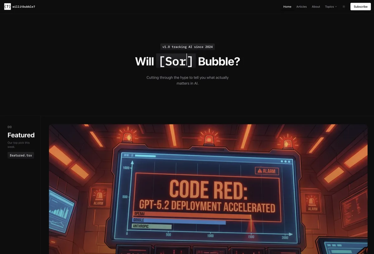
Will It Bubble is a tech commentary platform covering startups, venture capital, and technology market analysis. They needed a website that would stand out in the crowded tech media space while prioritizing reading experience. The challenge: create a distinctive visual identity that signals sophisticated tech analysis while making long-form content enjoyable to read. Most tech blogs look the same - generic templates that prioritize ads over content. Will It Bubble wanted to be different.
Our Approach
How we solved it
We designed Will It Bubble with content as the hero. The solution included: a bold, distinctive visual identity using modern typography and strategic color that sets the brand apart from generic tech blogs; content-first layouts optimizing every page for reading experience with proper line lengths, comfortable spacing, and clear hierarchy; article templates designed for long-form analysis with pull quotes, callouts, and visual breaks that maintain reader engagement; smart category and tag organization helping readers find content by topic, company, or theme; mobile reading optimization ensuring the experience is just as good on phones where much blog reading happens; and social sharing integration making it easy for readers to share compelling analysis. The design says 'serious analysis' while remaining inviting and readable.
Proven Results
The numbers don't lie
Distinctive
Visual identity that stands out in crowded tech media landscape
Optimized
Content-first design prioritizing long-form article consumption
Scalable
Category and tag system supporting growing content library
Excellent
Reading experience optimized for mobile consumption
Section 1
The Challenge: Standing Out in Tech Media
The tech media space is crowded. TechCrunch, The Verge, Ars Technica, and hundreds of smaller publications compete for reader attention. Most blogs look the same - generic WordPress themes that prioritize advertising over reading experience.
- •Generic templates making blogs indistinguishable from competitors
- •Ad-heavy layouts that interrupt reading and signal low quality
- •Poor typography making long-form content tiring to read
- •Mobile experiences that feel like afterthoughts
- •No distinctive brand identity in visual presentation
Key Point:
Will It Bubble wanted to be the opposite: distinctive design, content-first experience, and a reading environment that matches the quality of the analysis.
Section 2
The Solution: Content as Hero
We designed Will It Bubble around one principle: the content is the product. Everything else supports reading.
- 1.Bold Visual Identity - Distinctive typography and color palette that immediately sets Will It Bubble apart from generic tech blogs. The design signals 'serious analysis' before readers engage with content
- 2.Typography Obsession - Optimal line length (65-75 characters), comfortable line height (1.6-1.8), and carefully chosen typefaces for headers and body. These details determine whether readers stay
- 3.Article Template System - Layouts designed for long-form analysis with pull quotes, callouts, section breaks, and strategic whitespace. Readers engage with 2,000+ word pieces without fatigue
- 4.Smart Content Organization - Category and tag architecture that scales. As content library grows, readers can find articles by topic, company, theme, or author
- 5.Mobile-First Reading - The mobile experience isn't a compromise - it's the primary design target. Touch-friendly navigation, readable text, and smooth scrolling
- 6.Social Integration - Easy sharing without intrusive buttons. Readers who want to share can; readers who want to read aren't distracted
Section 3
Design Philosophy: Less Chrome, More Content
Most blogs are cluttered. Sidebars, ads, newsletter popups, related articles, social buttons, author bios - all competing for attention against the actual content.
"The best blog design is invisible. Readers should be immersed in content, not aware of the website around it. Every UI element must earn its place."
— Content-First Design Principle
Our approach:
- •Eliminate unnecessary elements - if it doesn't serve reading, it doesn't belong
- •Strategic whitespace - room to breathe makes content feel premium
- •Progressive disclosure - show more when readers want it, not by default
- •Consistent layouts - readers shouldn't have to relearn the interface on each page
- •Fast performance - nothing kills reading like slow page loads
- •Accessible design - readable for everyone, including those with vision differences
Section 4
Why Blog Design Matters for Content Businesses
Some publishers think design doesn't matter - 'content is king.' But design determines whether content gets read, shared, and remembered.
Key Point:
Poor design is invisible friction. Readers don't consciously notice bad typography or cluttered layouts - they just leave. Good design removes that friction.
- •First impressions shape content perception - premium design signals premium content
- •Reading experience affects engagement - comfortable reading means longer sessions
- •Brand identity builds recognition - distinctive design creates memorable presence
- •Mobile experience is table stakes - readers expect excellence on all devices
- •Social sharing depends on shareability - design affects whether readers spread content
Section 5
Ready to Build Your Content Platform?
Will It Bubble demonstrates what's possible when content businesses invest in design. The same approach works for any publisher, blogger, or content creator who wants to stand out.
If your content deserves better than a generic template, we can help.
"The design captures exactly what we wanted - serious tech analysis that doesn't look like every other tech blog. The reading experience is fantastic and our content finally has a home that matches its quality."
Will It Bubble
Founder, Tech Media
Key Insights
What we learned
Content-first design means the content is the hero, not the chrome. Every design decision should make reading better, not distract from it. Navigation, ads, and social elements support content, not compete with it.
Typography is 90% of blog design. Line length, line height, font choice, and hierarchy determine whether readers stay or bounce. We obsessed over typographic details because they make the difference.
Distinctive brand identity is possible even for blogs. Most tech blogs look identical because they use the same templates. Custom design creates recognition and signals quality before readers engage with content.
Mobile reading is primary, not secondary. More blog reading happens on phones than desktops. The mobile experience must be excellent, not a compromised version of desktop.
Long-form content needs visual breaks. Pull quotes, callouts, and strategic whitespace keep readers engaged through 2,000+ word articles. Wall-of-text layouts cause abandonment.
Organization scales with content. As a blog grows, findability becomes critical. Category and tag architecture built early prevents chaos later.
Get in Touch
Interested in Similar Results?
Ready to grow?
Want to achieve similar results?
Let's discuss how our custom website design & development services can help your media & publishing / tech commentary business achieve measurable growth.